UX/UI Redesign
A full redesign of a crypto-education platform, rebuilt as a streaming-grade product where learning feels like an experience, not a course list.
Context
→01Finanflix is a crypto and finance education platform for the Spanish-speaking market. I redesigned the entire product experience and proposed a set of new features along the way. As usual, I get most creative on the things I'm actually a user of, and I spend a lot of my own time inside learning platforms. I came in with strong opinions about what these products get wrong.
Finanflix isn't only education. It ships courses, live classes, and market reports. That mix sits much closer to a streaming service than to a traditional LMS, and the whole redesign leaned into exactly that idea: treat education like entertainment, without losing the depth.
Rebuilding the navigation
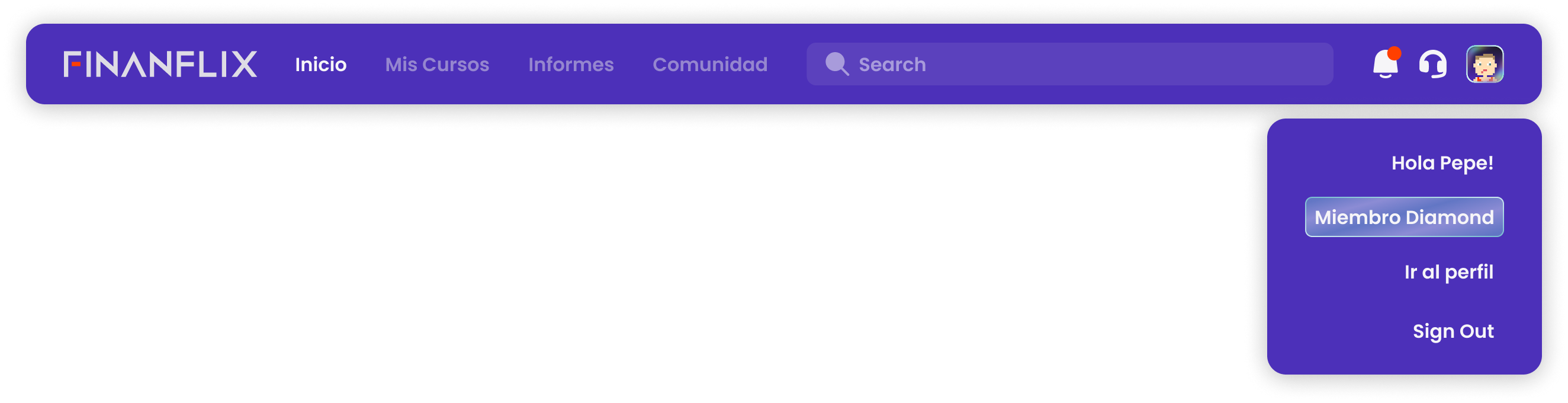
The existing navigation was incomplete and didn't reflect the structure the product actually needed. I rebuilt the information architecture from scratch, with new iconography and clear global access to everything that matters.
Discovery Home
A space that mixes owned and undiscovered content to drive exploration across every Finanflix program.
Reports, global
A core Finanflix asset, elevated into the global nav so it's reachable from anywhere on the platform.
Smart Search
One entry point to find courses, specific classes, and reports. Plus persistent notifications and support.
Identity & Tiers
→02Finanflix had toyed with an 8-bit visual concept in earlier designs that never shipped. I made it real. Using an open-source generative library (Dicebear), every user gets a unique 8-bit avatar they carry with them across the platform and the community. It's lightweight, it's theirs, and it gives the product a face.
Each subscription tier has its own visual identity through the avatar frame. Three tiers, three distinct treatments, each one escalating the sense of status.
Flixer · Tier 1
Vibrant and accessible. The avatar's colorway stays in harmony with the frame: orange field with a blue frame, or purple field with an orange frame.
Icon · Tier 2
Brand-blue to dark gradient background, gold frame, avatar clothing shifts to brand orange. A more exclusive feel.
Diamond · Tier 3
The premium tier. A prismatic shine that mimics a diamond's refraction, with an animated shimmer frame. Status, made visible.
Frames aren't decoration. They're belonging.
People want to belong, to stand out, to show status. When a user has a unique avatar with a frame that represents their tier, they feel part of something: "I'm a Flixer," "I'm Diamond." Push that into spaces like Discord and every member becomes a voluntary visual ambassador for the brand.

Onboarding
→03The old onboarding collected user information but the experience fell flat, with no memorable moment. I redesigned the full flow around two goals: make a first impression that feels premium and personal, and capture data that actually personalizes the experience from minute one.
The wow moment
On the first screen, the Dicebear avatar generates in real time as the user types their name, seeded with the brand (FINANFLIX-NAME). The 8-bit character comes to life in front of them, already wearing the frame of their subscription tier. Don't like it? Regenerate for a new variant. Identity is connected to membership before they watch a single lesson.
The whole thing is built in SVG and CSS, so it stays fast and crisp. This is the first contact with the platform, and it's designed to make the user feel that Finanflix isn't generic. It has personality.

I shipped a working playground where the team can test the avatar generation in real time, experiment with the seed, and feel the result before a single line is implemented. The difference between sending a Figma and sending a working product is what separates a proposal from an experience.
Personalization, redesigned
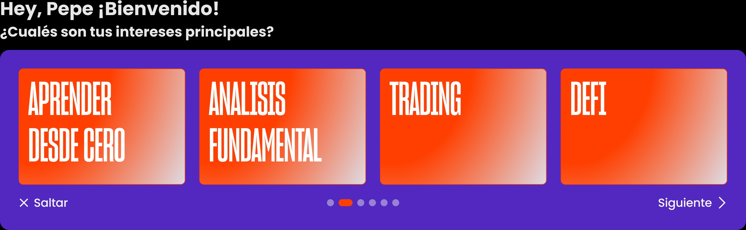
The proposal keeps the same question structure and completely rebuilds the interface: visual selectable cards, bold Finanflix type, and step-by-step navigation with a progress indicator. Every screen follows the same pattern, question on top, options as cards, Skip / Next always in the same place. That consistency cuts cognitive load and lets the user flow without thinking.
It's also a chance to capture data Finanflix doesn't collect today: timezone to sync notifications and live-class schedules, language or regional Spanish variant, and acquisition channel as a real signal for the growth team.
The flow closes on a letter. Not a confirmation screen, not a modal, an actual letter that unfolds on screen, addressed to the user by name and signed by the Finanflix team. Serif type on paper, a date, a signature. It's the one moment in the whole product that isn't an interface.
Every onboarding ends the same way: a progress bar hits 100% and you get dropped into an empty dashboard. This one ends with something worth reading. It costs nothing to build and it's the last thing the user sees before the product starts.
Home as Discovery
→04The core move of the redesign: turn a course list into a discovery surface that behaves like a streaming home. The first thing you see should pull you in, the same way the platforms you already binge do. Drag to compare.
 After
After Before
Dynamic banner
A layered component: animated course cover (manual or AI) under title, description, and a direct CTA. Auto-rotating carousel with hover arrows and position dots.
Live feed
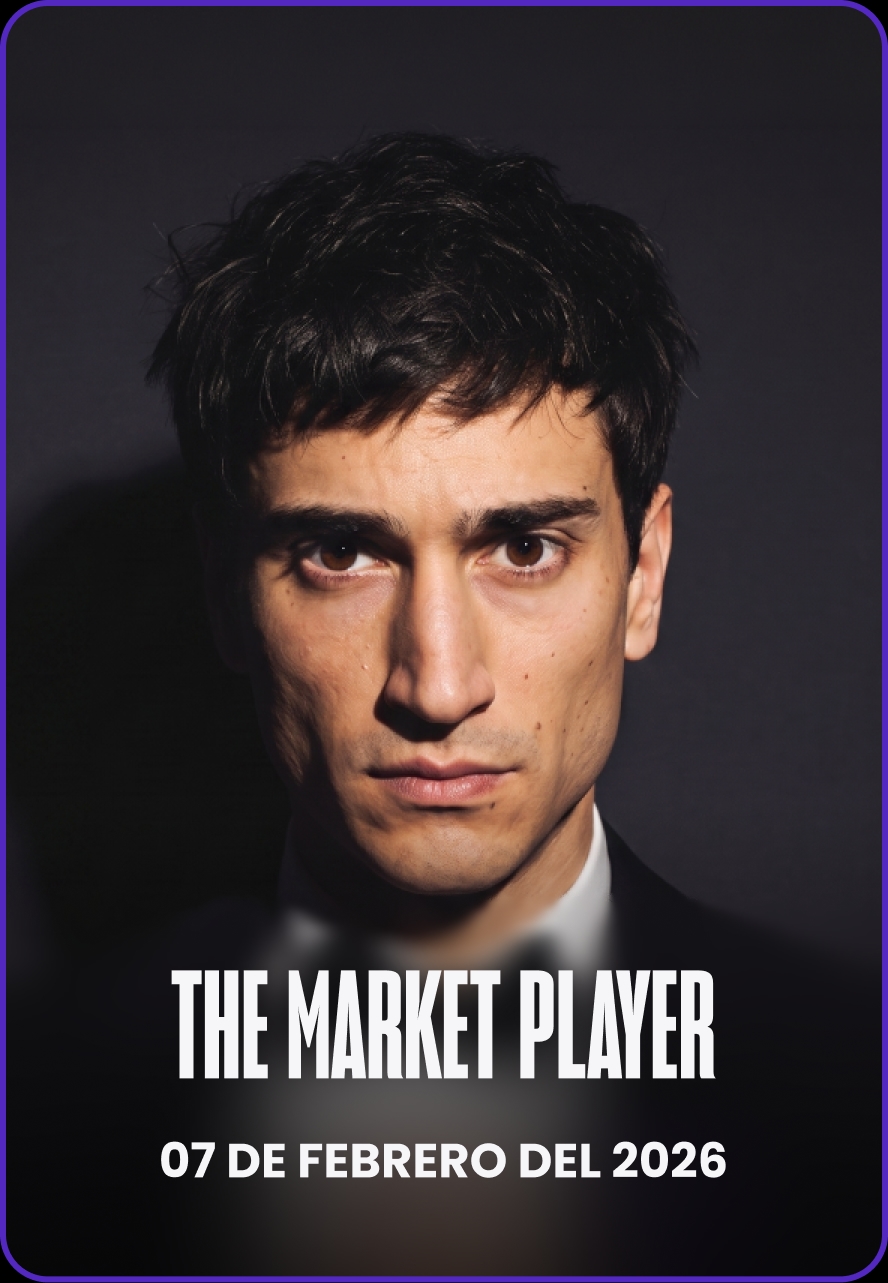
Live classes presented as series posters, each with its own branding. A real-time feed, not a generic list.
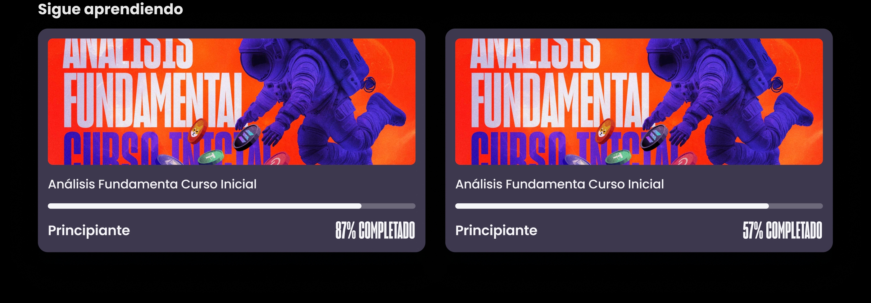
Keep learning
The last two in-progress courses with progress bars front and center, prioritizing continuity.
Why video over a static image? Movement captures attention immediately. A still competes with everything else on screen. A subtle loop makes the home feel premium and alive, signaling the platform is active and the content is fresh. The banner also doubles as flexible space for events, news, and launches.

Class card states
The live feed runs on a small state machine. When a class is scheduled within 24 hours, the first card shows a countdown and a direct link to the meet. Otherwise it shows the latest classes. Content the user can't access stays visible on purpose, so they feel what they're missing.
The resting state. Class branding on the cover, title, and date. Every card in the feed is a poster for its own series rather than a row in a schedule.
The Course Experience
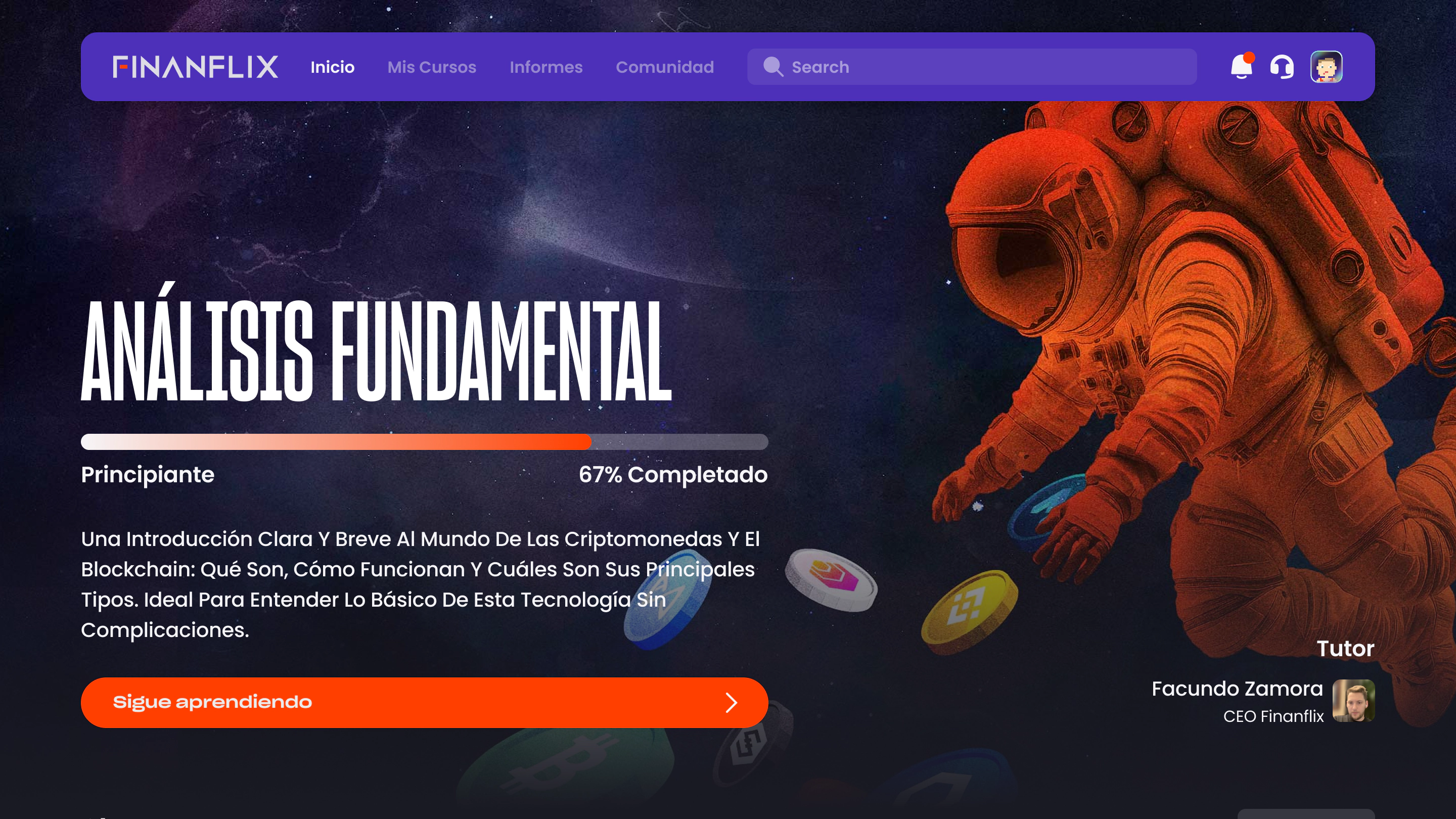
→05The individual course page is rebuilt as a landing. The hero uses the same idea as the home banner: a video background (manual or AI), or a trailer-style recap of the course, with the title, level, progress, description, and the tutor who teaches it. A prominent "Keep learning" CTA drops the user straight back where they left off, or "Start" if they're new. For locked courses the same layout holds and the CTA becomes "Subscribe," so interest builds before the conversion.
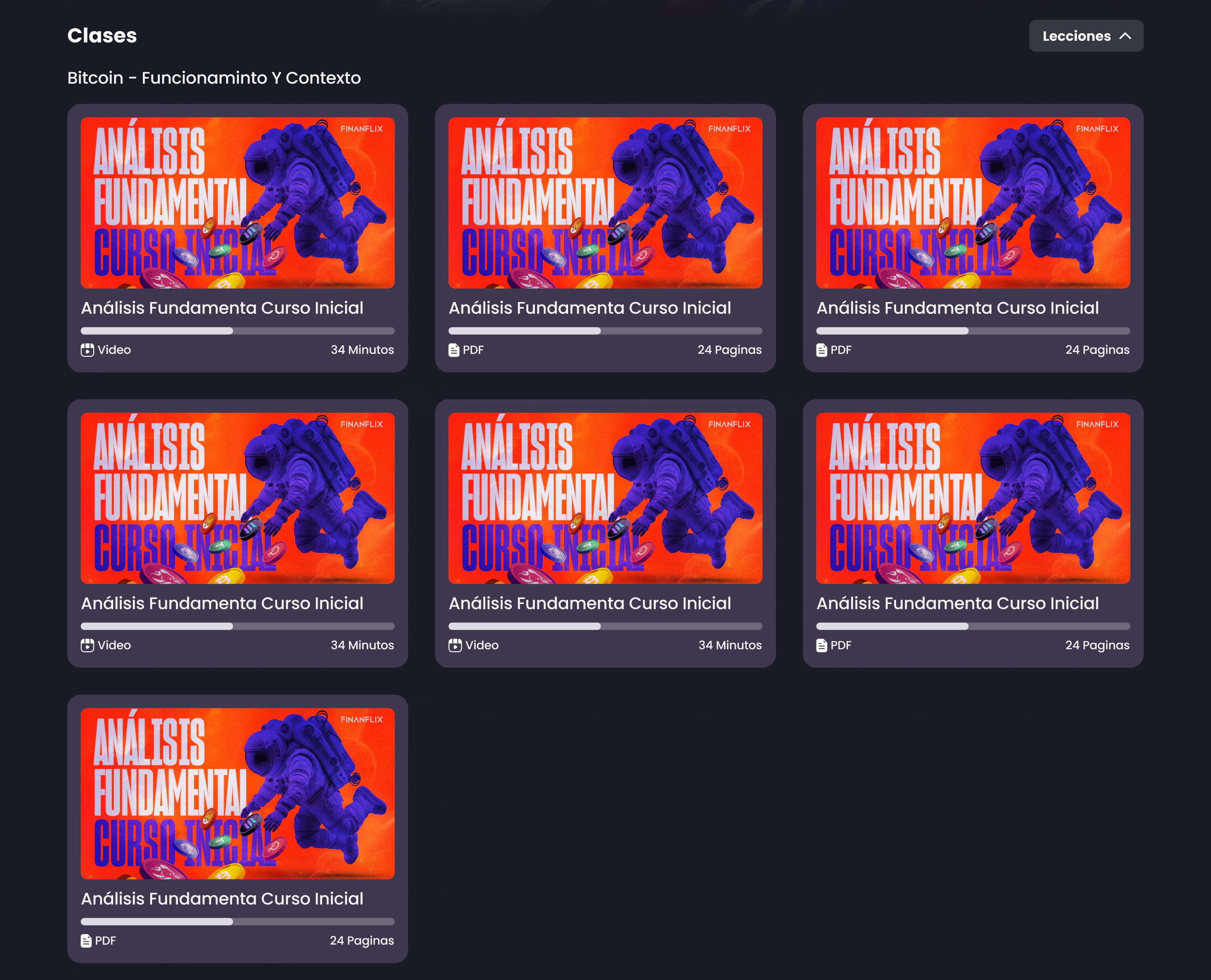
Content is organized into named lessons ("Bitcoin - How It Works and Context"). Some courses unlock progressively every 24 hours, others allow free navigation. A lesson selector dropdown lets the user move between sections, like choosing a season in a series. Each class card shows its own thumbnail, an individual progress bar, the type (Video or PDF), and its length.
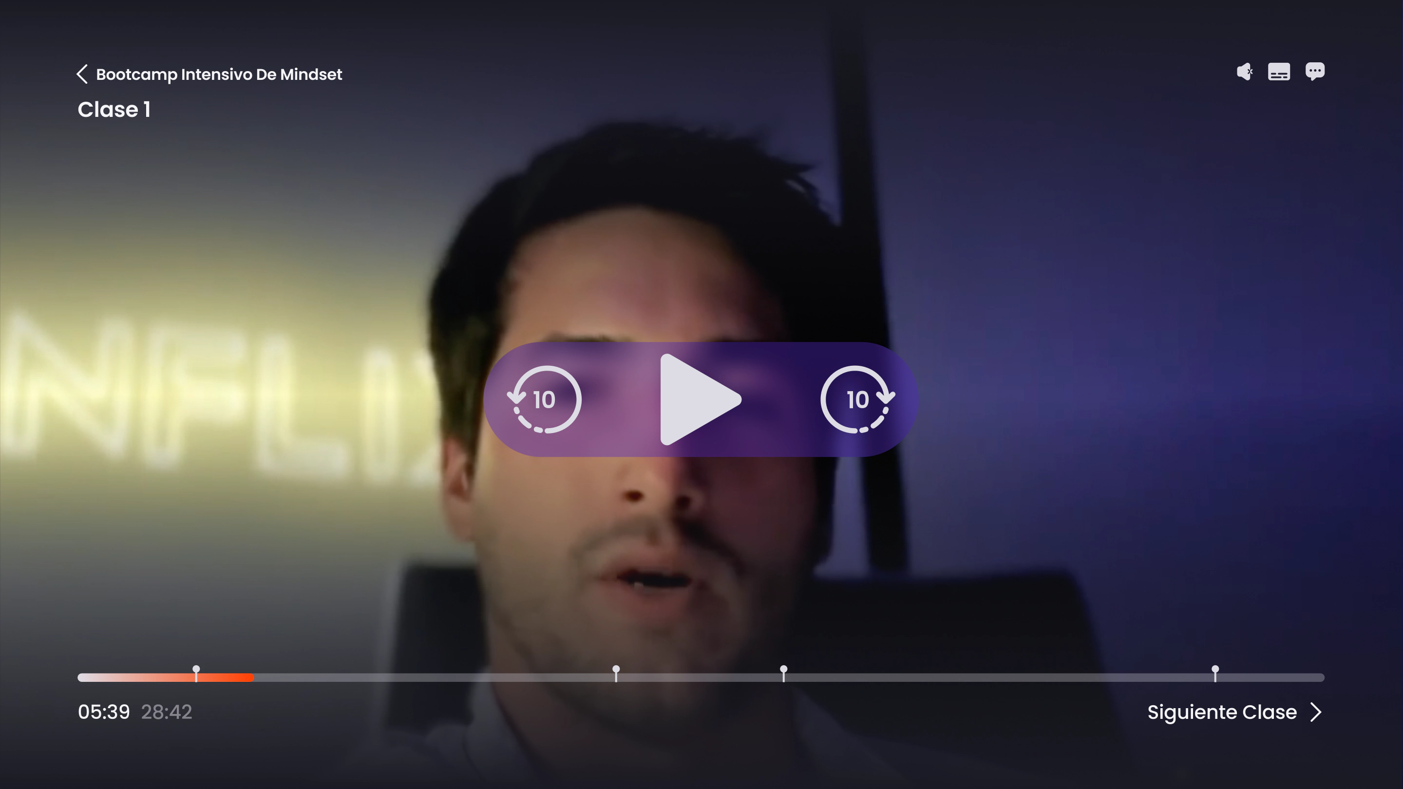
For a learning platform, the player is the product.
The old player was generic, no personalization, no extra functionality. It has to look and work at the level of everything around it. So I built a fully custom player on Vidstack, an open-source library used at scale on platforms like Reddit, dressed in the Finanflix identity with controls designed specifically for learning.
Timestamped notes
The most important feature. Each note is pinned to the exact keyframe of the video, so the user can jump back to the precise moment they wrote it.
Built-in toolbar
Three controls in the top-right corner: volume, subtitles, and notes. Custom, on-brand, out of the way.
Two modes
Clean mode and notes mode, switchable without ever leaving the video.
The video fills the screen, the controls appear on hover, and notes stay hidden. Pure focus on the content.
Reports
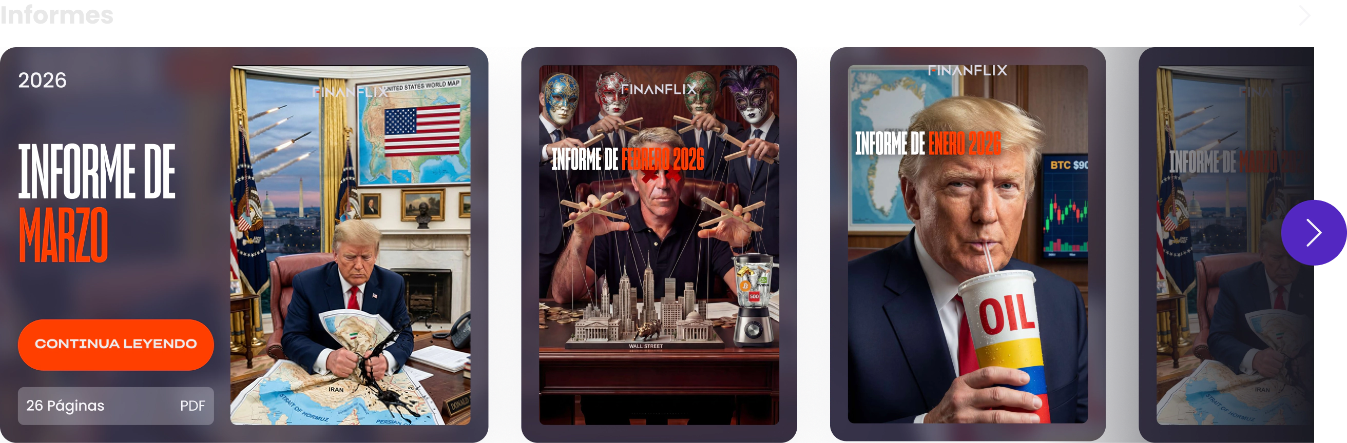
→06A completely new section with a distinct design that separates written reports from video content. The cards use an editorial, magazine-style treatment that gives the writing weight and seriousness.
Editorial cards
A magazine look that makes the written content feel like a publication, not an attachment.
Open & compact
The newest report opens expanded (cover, Continue Reading, page count, PDF). The rest stay compact, cover only.
Full archive
A dedicated Reports page mirrors the home, with the full history organized by year in a four-column grid.
A small production note that keeps both states clean: export two versions of each cover, one with the report title and one without. When the card is open and the title already shows as UI text, the cover doesn't repeat the same information.
Reflection
→07I came into this project as a user first. I had strong instincts about what study platforms get wrong, and the redesign was a chance to act on every one of them.
The throughline is consistent across the whole product: treat education like entertainment without losing the depth. Identity through the avatars and tiers, discovery through the streaming-style home, and craft through the note-taking player all push the same idea, a platform with personality instead of a generic LMS.
Everything in the proposal shipped. The biggest lesson was how much a single memorable moment, the avatar coming to life during onboarding, can reframe how an entire product feels before the user has done anything at all.